The Workspace Experience
A unified, intelligent front-end that turns complex backend logic into clarity for case workers.
The Impact
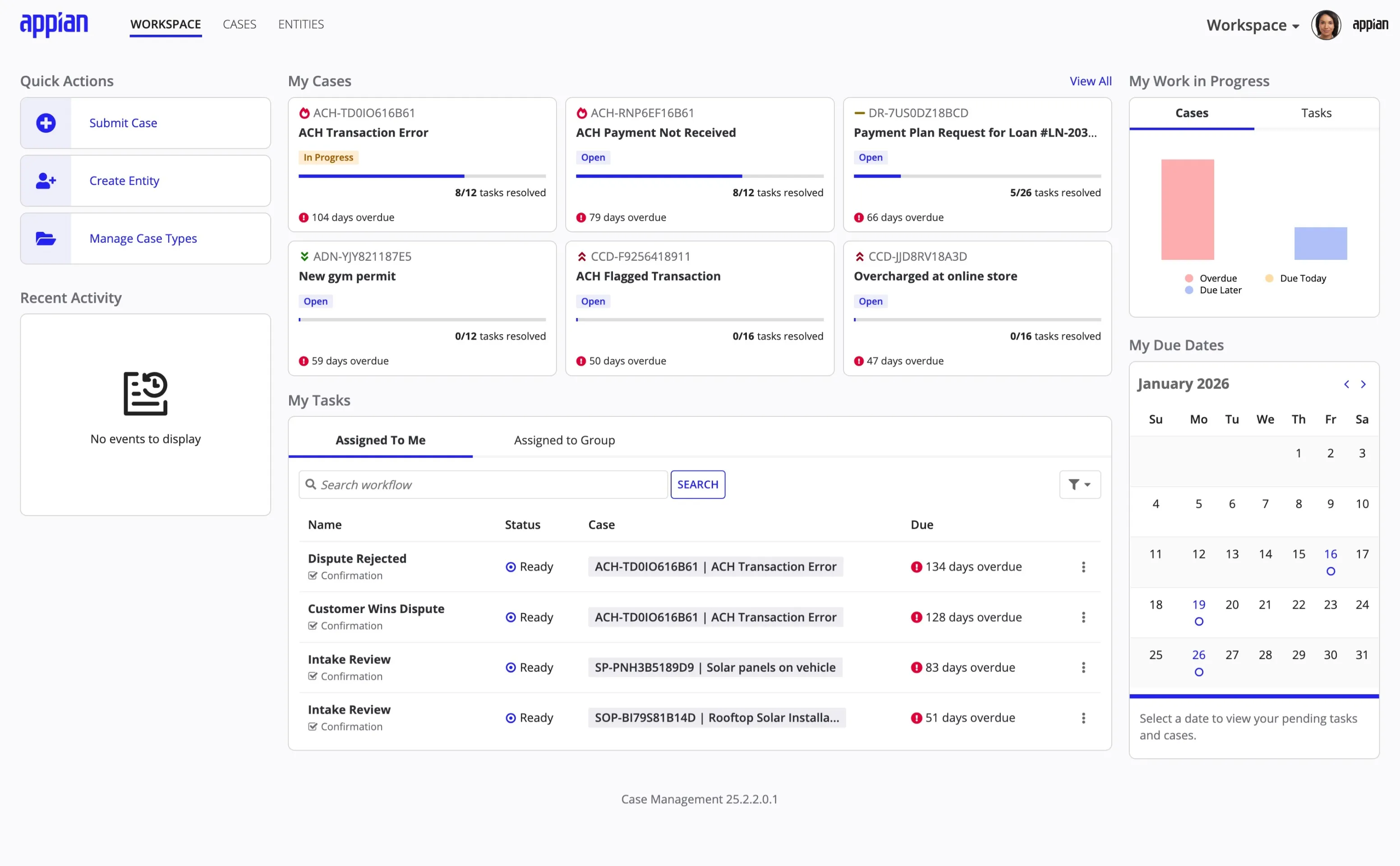
The Workspace is the front-end interface where case workers review information, make decisions, and interact with external users.
Adoption and Scale
- Global Validation: The interface drives daily operations for major organizations including Porsche, Pfizer, and the Australian Government.
- Accelerated Deployment: Because the workspace UI is dynamically created from Studio configurations, customers avoided the months typically spent designing custom user interfaces. This allowed organizations to go live with a modern experience using the latest design patterns significantly faster than legacy builds.
- Operational Improvement: The introduction of the authenticated “My Cases” site offloaded a significant volume of manual “status check” emails, allowing internal teams to shift focus from support tickets to high-value case resolution.
The Challenge
Disconnected Data
Case management requires coordinating information from disparate sources—emails, documents, external sites, and internal databases.
The Fragmentation: Employees struggle to find the single source of truth needed to make the right decisions. Without a system enforcing specific rules, cases can fall through the cracks.
The Goal: Design a unified workspace site that centralizes all case information, enforces business logic defined in Studio, and uses AI to accelerate decision-making.

Key Constraints
Platform Limits
Strict adherence to low-code capabilities meant visual design had to focus on layout and hierarchy rather than custom styling.
Modularity
To avoid the <strong>monolithic</strong> debt of legacy apps, features were designed as optional modules that could be slotted in or out.
Proxy Research
Validation relied on proxy users and subject matter experts (Customer Success) rather than direct access to end-users.
The Solution
Centralized Information
The Single Source of Truth
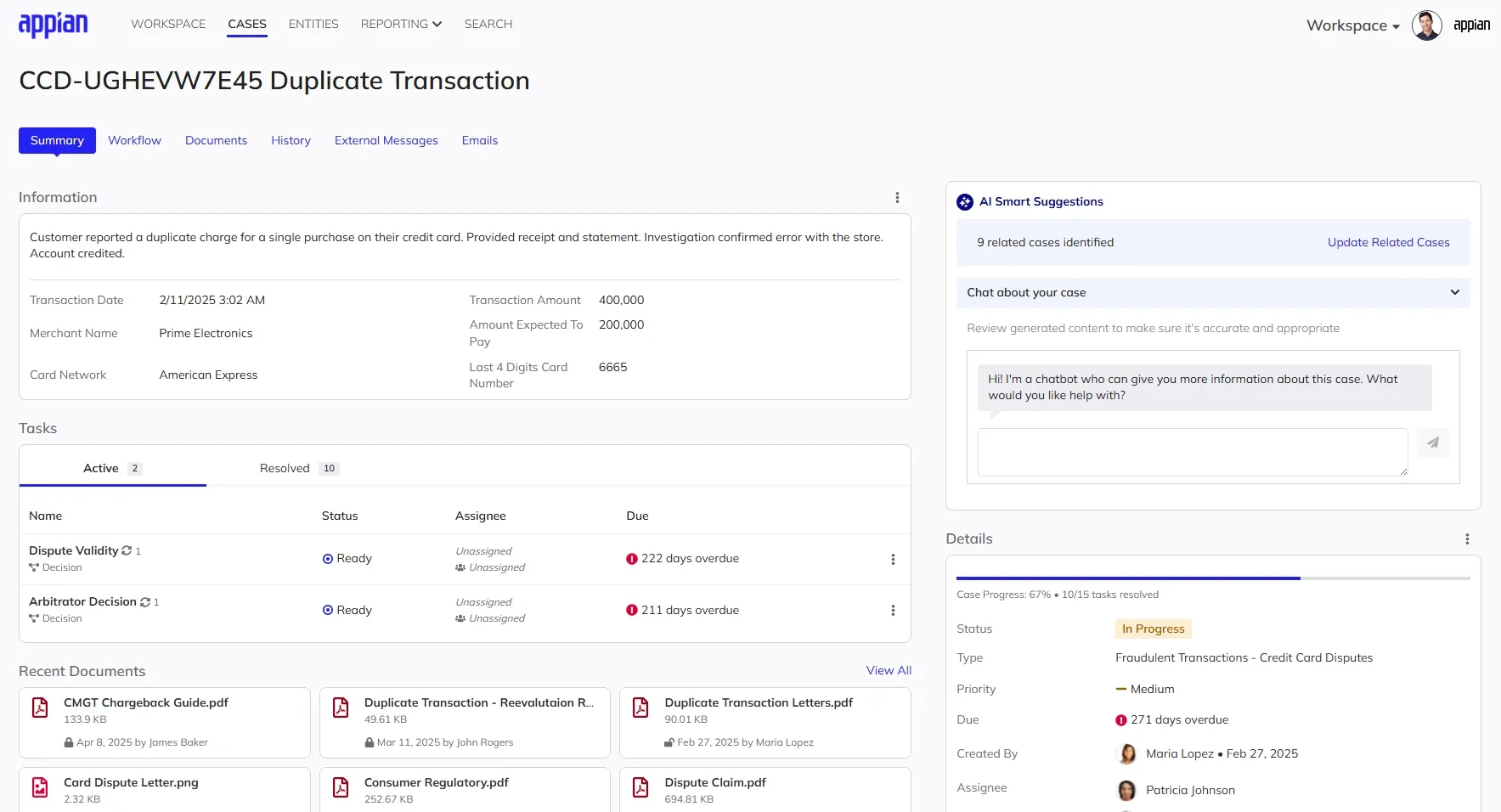
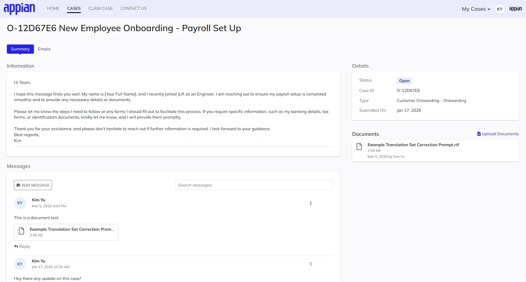
To solve the fragmentation issue, the case record aggregates all necessary context into one view.
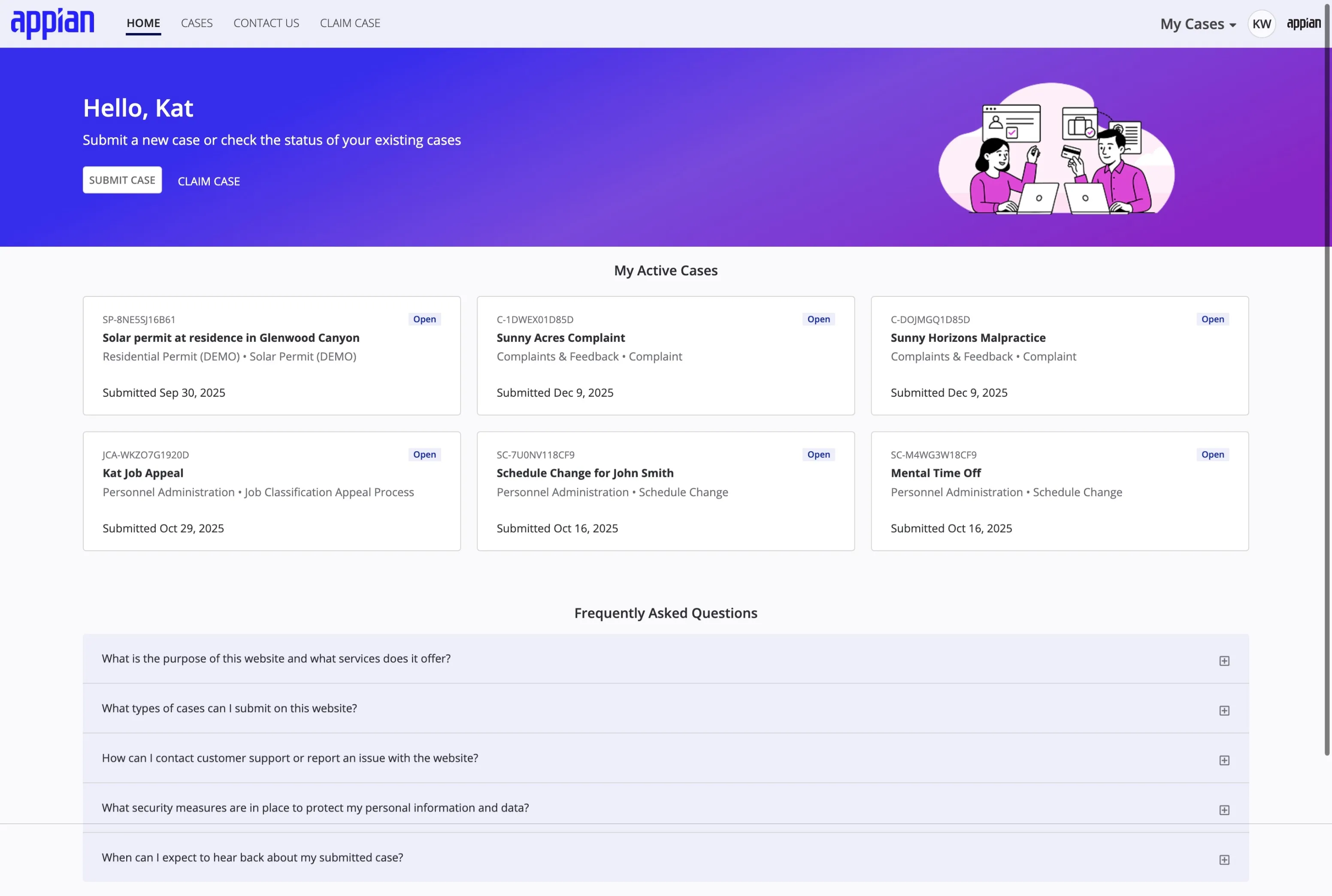
- The Case Summary: Upon opening a case, the user sees a consolidated view of the description, milestones, watchers, and critical data.
- Dynamic Layouts: While the core navigation structure remains consistent for usability, the system dynamically renders case-specific forms and data fields based on Studio configurations.
- Industry Agnostic: The interface is designed to be framework-agnostic. Whether configured for government permitting or commercial insurance, the workspace adapts its layout and logic while maintaining a consistent, accessible user experience.
Inclusive & Accessible: The entire workspace experience is fully responsive and compliant with WCAG 2.1 AA standards, supporting screen readers and keyboard navigation.

Process: Validating the Experience
Designing for Relevance
A core tenet of the design was to keep the application focused. We adopted a modular architecture as a result of close collaboration between business, development, and design. This ensured that the interface only displays features relevant to a specific configuration, preventing the unnecessary complexity common in legacy software while maintaining a scalable codebase.
- Intentional Layouts: Foundational decisions like navigation placement were validated through testing. While the Studio environment uses a sidebar for its deep hierarchy, users confirmed that a top navigation model was better for the Workspace, as it preserved horizontal space for reviewing data and documents.
- Validation: Participants in usability studies reacted positively to this streamlined approach. They noted the interface felt cleaner than previous iterations and confirmed that the layout successfully aggregated necessary details without overwhelming the user.
- Result: The final design provides a unified interface that remains flexible enough to support diverse business needs while keeping the worker focused on the task at hand.
"I think you guys have nailed it with the way that this is built out."
"You did an awesome job of... pushing the limits of the UX."
"The business user interface design experience will drive widespread adoption."
"It’s really impressive what we were able to show in the first demos."
AI-Powered Assistance
Accelerating Decisions
Private AI was integrated to help case workers process large volumes of information without leaving the context of the case.
- Contextual Chat & Discovery: A secure AI chat panel allows users to query case history and automatically surfaces similar past cases to suggest potential resolutions.
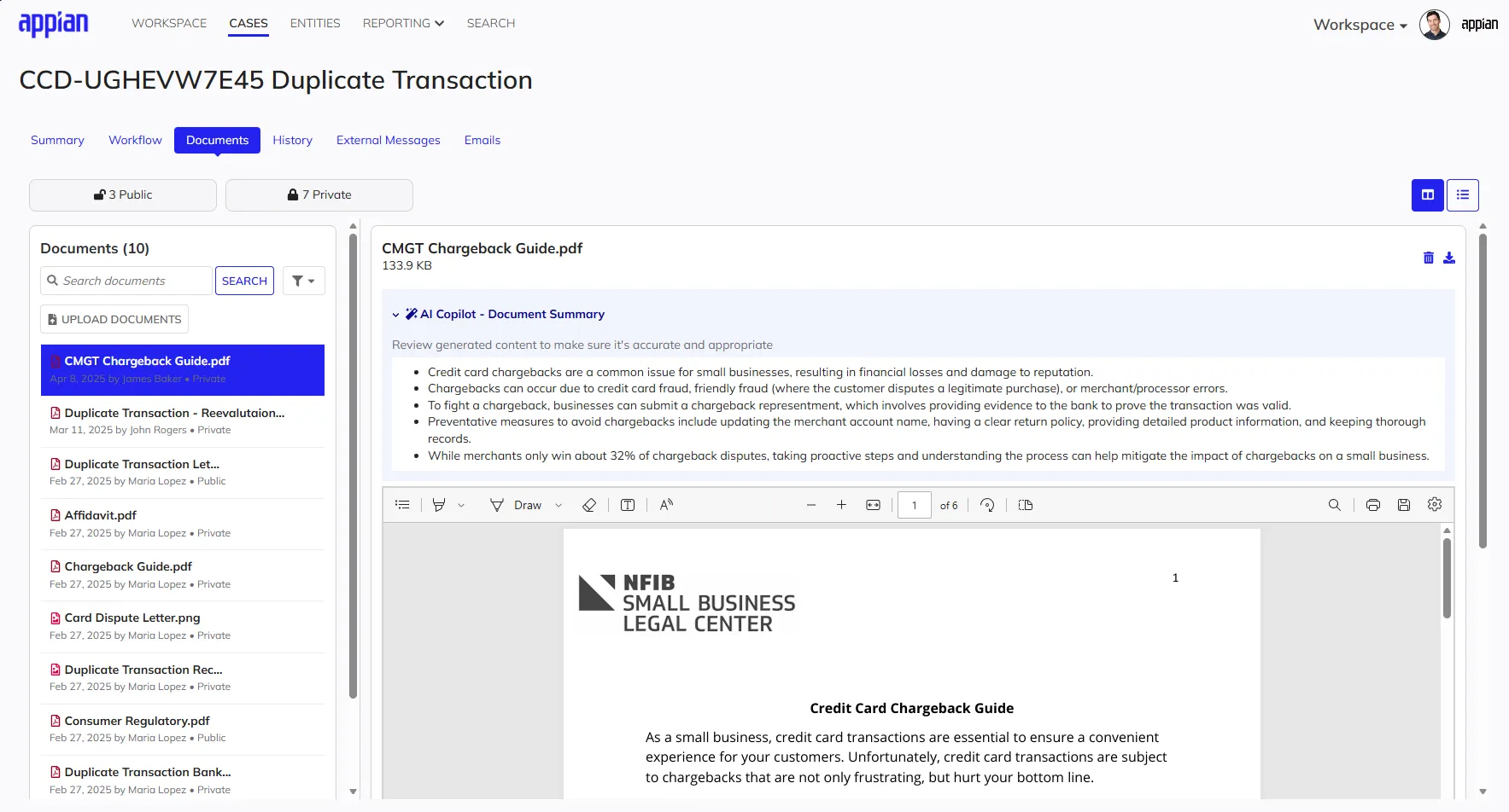
- Intelligent Summarization: Users can instantly summarize lengthy comment threads or complex PDF documents, extracting key points without manual review.
- Prompt Engineering: The underlying prompt strategies were architected and iteratively refined to ensure the AI generated summaries that were concise, citation-backed, and structured specifically for rapid decision-making.

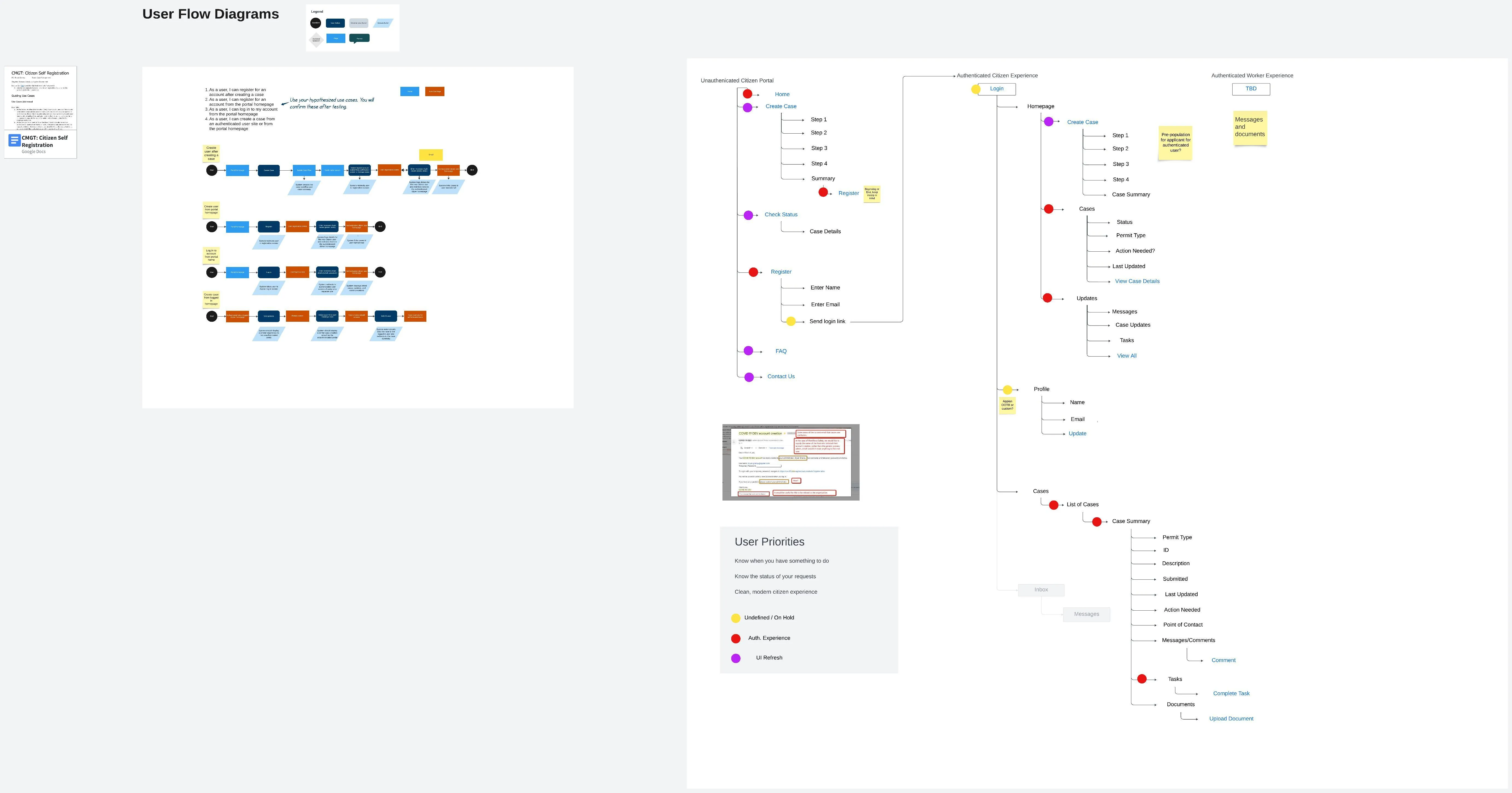
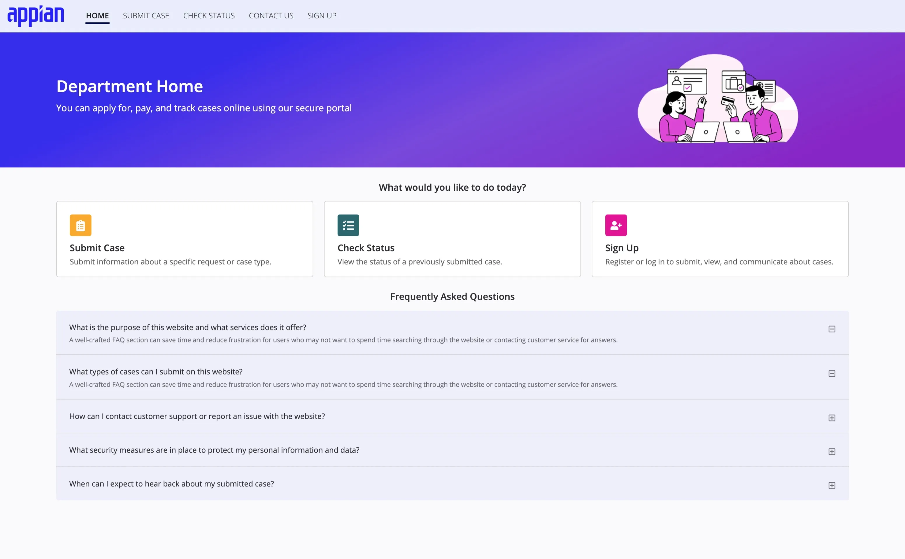
Public Access & Self-Service
Public Portals & Authenticated Self-Service
Case management isn’t just for internal users. The design of the external experience ensures that public interaction with government and enterprise services is seamless, secure, and accessible on any device.
- Public Portals: A mobile-first entry point for anonymous users to discover services, find information, and begin the application process.
- Secure Intake: A guided “no-login” submission flow that allows users to submit cases quickly while ensuring data integrity.
- Authenticated Self-Service: Once signed up, the “My Cases” dashboard allows users to track their progress, upload missing documents, and communicate directly with case workers.
Mobile-First Accessibility: Since external users often access these services via mobile devices, a responsive design that met WCAG 2.1 AA standards was prioritized. This ensured that critical services were usable for everyone, regardless of their device or ability.
Process: Designing for the Public
Shifting the Design Language
While the internal workspace focused on density and efficiency for trained experts, the external portal required a fundamental shift in design language to support novice users.
- Consumer-Friendly UX: We simplified the interaction model, breaking down complex intake forms into guided, bite-sized steps. The visual style was adjusted to be more welcoming and less enterprise, using clearer typography and more generous spacing to reduce cognitive load.
- Mobile-First Strategy: Recognizing that citizens often access services via smartphones, the entire self-service experience was designed mobile-first. This ensured that critical flows—like self-registration and case tracking—were fully functional and accessible on smaller touch screens, not just scaled-down desktop views.
- Seamless Integration: Special attention was paid to the handoff between unauthenticated public access and authenticated self-service, ensuring that the transition from initial discovery to secure account management felt like a single, cohesive journey.